
Microsoft recently unveiled the first stable version of FluentUI React v9 (@fluentui/react-components). This new edition of FluentUI is the result of joint efforts from the Office and Teams product teams to streamline their respective React front-end libraries into one component framework.
To celebrate this 🎉, I have released 2 community PowerApps Control Framework (PCF) Controls that targets this new library.
In this post I will reflect on my experience authoring PCF controls with this new set of components and highlight the main differences with prior versions.
But first, here are the links to my new PCF controls. Download them from their respective github repo or play with them in their associated Storybooks.
FluentUI Badge PCF
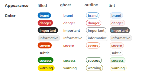
FluentUI v9 as a very decent badge system, and this PCF control is merely a (configurable) wrapper around the out-of-the-box badge control exposed by the library.
The control can be installed on almost every type of Dataverse field. UX-wise, it’s a good way to put emphasis on your forms read-only data.
If you are into badges, I also have developped another cool PCF control that renders Shield.Io badges. Have a look here :

PCF control - Generate Shields.IO Badges in the PowerPlatform - It Must Be Code!
FluentUI Slider PCF
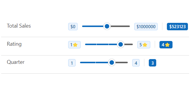
This control is a bit more complicated than the first one and includes more components like Badges and a Tooltip that follows the handle to provide more context to the user. Use this one to infuse some joy over your forms numerical fields.
Why FluentUI is a good match for PCF controls ?
Considering that React and FluentUI (version 8) are the main librairies used by PowerApps runtime to render Model-Driven Forms, it’s a natural choice (at least for me) to leverage the same stack for PCF control development.
By doing so, while you might have some styling to do, you ensure that the control will blend nicely with the existing form thus providing a better UX.

What as changed in FluentUI v9
Even though they share the same branding, FluentUI React v9 (@fluentui/react-components) is not an upgrade ⛔ from v8 (@fluentui/react) but a completely different library with a new architecture. In fact as stated in the official doc :
Fluent UI React Components is a set of UI components and utilities resulting from an effort to converge the set of React based component libraries in production today:
@fluentui/reactand@fluentui/react-northstar.
🔖Bookmark the link to the official docs, this is where you’ll find up to date information on the library controls, code examples and upgrade path from previous versions.
As you would expect, FluentUI React v9 offers a rich set of form controls like Input, Button, Checkbox and so on. Keep in mind that some of them are still in preview (ex. Dropdown) (see 🛣️ roadmap here)
At this point in time not all the controls from v8 have a v9 counterpart, but on the bright side, there are some controls that are unique to v9 like the Badge component that I used in my 2 PCF controls.
The most notable differences from FluentUI v8 revolves around these aspects that will be discussed later on.
- 🎨Theming
- ✨Styling
- 🖥️Rendering
- 🏃🏽Performance
Getting started
First, let’s see how to setup a PCF project to use the library.
Here, I assume that you already have installed React on your PCF project and that all the plumbing is done in the index.ts file to render the control as a React App.
Simply, npm install the FluentUI React v9 library (@fluentui/react-components) in your project.
npm install @fluentui/react-components
Now wrap your React component/app with a <FluentProvider /> and provide a theme as a prop. As you can see in the folowing example that renders a very simple FluentUI Button.
import { Button, FluentProvider, webLightTheme } from '@fluentui/react-components'

const SimpleApp= (): JSX.Element =>
    <FluentProvider theme={webLightTheme}>
       <Button appearance="primary">Hello FluentUI React v9</Button>
    </FluentProvider>

export default SimpleApp
🎨Themes
One of the main difference between FluentUI React V9 and v8 is the ability to provide (inject) a theme to a component. A theme is basically a set of common tokens that can be assigned as CSS properties. Each theme having its own definition of a specific token.
Offial docs : Concepts / Developer / Theming - Page ⋅ Storybook (fluentui.dev)
As we saw earlier, a theme is injected through the <FluentProvider /> element. The Fluent UI v9 components will natively adapt to the provided theme and any exposed tokens of the theme can also be used to further customize the styling of the app.
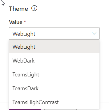
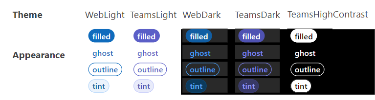
There are 5 out of the box themes :
- Web Light
- Web Dark
- Teams Light
- Teams Dark
- Teams High Contrast
See the all the color definitions and token list here : Theme / Color - Page ⋅ Storybook (fluentui.dev)
In the controls that I published, I included a Theme parameter so that a theme can be supplied by the end-user to alter the look and feel of the PCF controls.
As you can see here, the same control will render differently depending on the applied theme.
You can also create (or extend) your own theme, have a look at this artice
Quick branded light and dark modes with Fluent UI React v9 - DEV Community
✨Styling
In terms of styling, FluentUI React v9 is built on top of Griffel , a new open source CSS-in-JS engine from Microsoft. You can find a lot of good information on in the docs here.
In a very simplistic example, here is how to use Griffel to style a component:
- Define your classes using the makeStyles Griffel function (needs to be defined outside of the element)
- Reference the resulting hook inside your component.
- Any exposed class can now be injected in the components via the className attribute
import {
  makeStyles,
  tokens,
  Button,
  FluentProvider,
  webLightTheme
} from "@fluentui/react-components";

const useStyles = makeStyles({
  myclassname: { backgroundColor: tokens.colorPaletteRedBackground3 }
});

const SimpleStyleApp = (): JSX.Element => {
  const classes = useStyles();

  return (
    <FluentProvider theme={webLightTheme}>
      <Button className={classes.myclassname}>Hello FluentUI React v9</Button>
    </FluentProvider>
  );
};

export default SimpleStyleApp;
One of the component that I used a lot from FluentUI v8 is the Stack component. The stack components lets you easilly position your elements in an horizontal or vertical manner. In fact its syntactic sugar that wraps your element in CSS Flexbox layout.
Unfortunaletly there are no direct alternative for Stacks and StackItems in v9 but there is a nice section in the docs on how to upgrade components from v8 to v9. There, you’ll find how to use FluentUI v9 CSS-in-JS to achieve the same results as the v8 Stacks and StackItems.
I have used a slightly modified version of the upgrade path in the FluentUI Slider control and I was able to stack my elements nicely. Here is a simplified version that renders horizontal (row) and vertical (column) stack.
🖥️Rendering
Another big architectural change in FluentUI v9 is the use of Slots. By definition slots are parts of a given component where you can inject anoter react element.
This is a real game changer compared to v8 where you often have to inject complex rendering callback function to alter the look and feel of a component.
Heres a good post that explains how to work with FluentUI v9 Slots
Using Slots with Fluent UI React v9 - DEV Community
Here is a very good example that shows the simplicity (and power) of working with slots. We see that the content attribute of a Tooltip component can accept not only a simple text attribute but any other complex components (JSX.Element) like a Badge or an Avatar.
import { Tooltip, Badge, Button, Avatar, FluentProvider, webLightTheme } from '@fluentui/react-components'


const SimpleSlotApp = (): JSX.Element =>
    <FluentProvider theme={webLightTheme}>
        <Tooltip content='simple text injected' relationship='label'>
            <Button>
                Hover me (simple text)
            </Button>
        </Tooltip>

        <Tooltip content={<Badge>Badge injected</Badge>} relationship='label'>
            <Button>
                Hover me (badge)
            </Button>
        </Tooltip>

        <Tooltip content={<Avatar
                            name="David Rivard"
                            image={{ src: 'https://avatars.githubusercontent.com/u/38399134?s=400&v=4' }}
                        />} relationship='label'>
            <Button>
                Hover me (Avatar)
            </Button>
        </Tooltip>
    </FluentProvider>


export default SimpleBadgeApp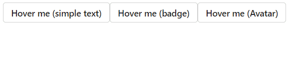
I have used this technique in the FluentUI.Slider.PCF to render a badge inside the Tooltip, look at the source code for reference.
🏃🏽Performance
One of the claim made by the FluentUI v9 team is they refactored, slimmed down components and optimize the dependencies. This should produce lightweight and performant components.
In the context of a PCF control project, I already blogged on a problem I had building my project with FluentUI v9, so please have a look and be sure to configure your tsconfig.json file correctly, to optimize the final bundle size.

PCF Controls - Tree-Shaking For Better Bundle Size - It Must Be Code!
In terms of bundle size, I think it kind of delivers. The the FluentUI Badge and Slider PCF components are below the bar of 90kb for the deployable managed solution. (Manifest + bundle + image)
Takeaway
Overall, my experience with FluentUI v9 is very positive. I really like some of the new features especialy the slots system that removes some complexity I have experienced in the past using controls from v8.
I like the theming capabilities as it brings consistency to the look and feel. And, since Teams is becoming the Hub for a lot of applications, having a way to design components with the official Teams colors is a big plus.
Will I still use FluentUI v8 ? probably if I need to render text flields or dropdowns in a Model-driven app, only because v8 is the current library used by the product.
But who knows 🤷 maybe FluentUI React v9 will become the next PowerApps runtime library. So I think that learning how to tackle with it is a good time investment for PCF developers.
Links


Photo by Adrian Curiel on Unsplash
Very insightful article. This is Jan 2024. Do you have any knowledge of how long it will be before a control-type=”virtual” targets v9?
Thanks, glad you like it. I don’t have any clue on when v9 will be natively supported in virtual controls, but my guess is that it will come soon (fingers crossed).