
If you’re a user of a Power Platform’s model-driven app, you’ve likely come across the ’ Try the new look’ switch appearing on your app header.

Indeed, toggling this switch will result in the platform adopting a modern Fluent Design System (a.k.a. Fluent 2) for rendering model-driven form elements such as fields and command bars.
While this evolution is undoubtedly a positive and necessary step for the platform as a whole, it can present several challenges for PCF Control authors aiming to ensure their controls seamlessly blend with the out-of-the-box UI, delivering a polished user experience.
In this article, I will demonstrate a method to dynamically detect whether the user has activated the New Look feature within the PCF business logic and adapt the control’s rendering accordingly.
Under the hood of the New Look
As said before, switching to new look will completely change the rendering of model driven app form and use a Modern Fluent design system. Under the hood, the main rendering library for form components changes from Fluent UI React 8 ( @fluentui/react) to FluentUI React 9 ( @fluentui/react-components).
Link to Microsoft official announcement 🔗Modern, refreshed look for model-driven apps - Power Apps | Microsoft Learn
As an example, see below the difference observed for a Choice field (dropdown list). You can see that the difference is notable.
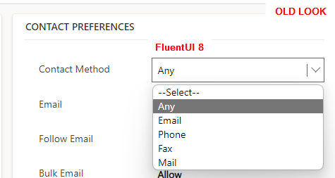
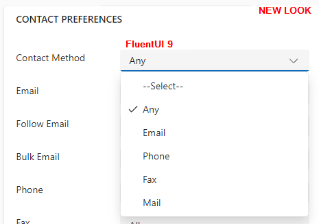
As of now, its every users decision if they want to use the new look or if they prefer to stay with the previous version by toggling the ’ Try the new look’ switch on the header.
How does this impact PCF Controls
PCF controls (PowerApps Component Framework) are customizable components that extends the functionality of Microsoft Power Platform and Model-Driven Apps by allowing developers to create and integrate custom UI elements and business logic.
To ensure a smooth user experience, it’s crucial to deliver controls that seamlessly integrate with the overall form. For this reason, making use the Fluent UI React 8 library was an obvious choice for PCF developers, given that it was the library used internally to render other form elements.
Here are some of my community PCF Controls that are leveraging FluentUI React 8
🔗Lookup Dropdown PCF | PCF Gallery
Now, with the advent of the New Look, the situation has taken a different turn. I would encourage PCF developers to initiate the transition of their controls to Fluent UI React 9 as soon as they can.
Furthermore, considering that end users have the flexibility to switch between the two rendering modes, it would be advantageous for PCF controls to transition contextually from a Fluent UI version 8 to version 9 implementation when necessary.
💡Transitioning from Fluent UI version 8 to version 9 is not merely a straightforward update; it represents a complete architectural overhaul of the library. The development experience is completely different and I personally find FluentUI 9 to be much more enjoyable.
You can have a look at my previous blog post on the subject 🔗Develop PCF Controls with FluentUI REact 9
Let’s see how we can detect the user look and feel selection inside a PCF control logic.
Identify the Look chosen by the user
As a proof of concept, I developed an extremely basic PCF control, intentionally lacking any complex logic, that renders an input field. The objective is to identify the user’s choice (New Look or Old Look) and display an input field that seamlessly integrates with the overall form design.
You can find the source code on Github: 🔗drivardxrm/NewLookSwitchTest.PCF
Through examining the context object provided to the PCF control in both scenarios, one with the New Look feature enabled and the other without, we can see that the ( undocumented) ’ fluentDesignLanguage’ property exclusively holds a value when the New Look feature is turned on.
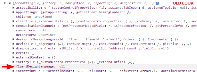
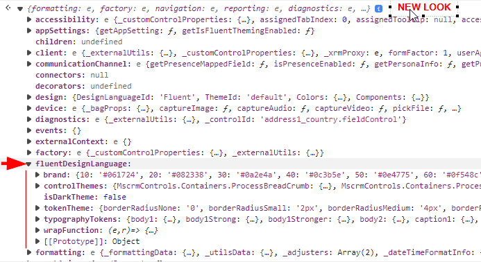
With this information at hand, it’s simply a matter of offering two implementations of the control and rendering them accordingly based on the user’s choice.
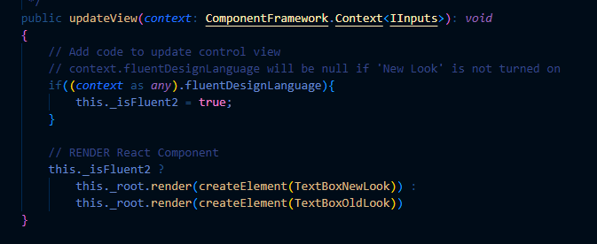
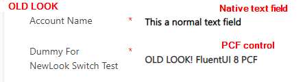
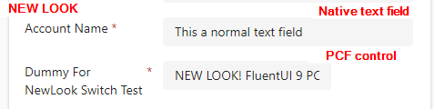
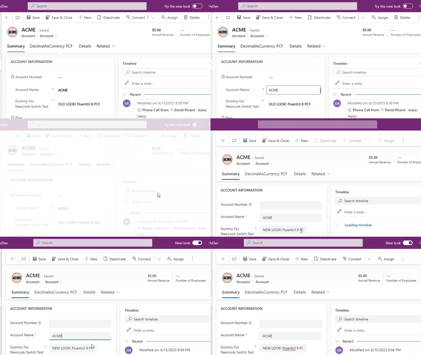
Feel free to review the source code for the individual implementations. However, as depicted in the images below, you can see that the rendering of the PCF control changes when the New Look feature is activated.
Additionally, both implementations integrate seamlessly with their respective Form design system.
TakeAway
All this is good for blog post material, but there are some things to take into considerations for developers who would go down that path.
Introducing dual implementations can entail additional complexity and potentially result in larger bundle size. Ultimately, it comes down to striking the appropriate balance between development cost, maintenance, and delivering an optimal user experience.
At least, its good to know that there is a way (even if unsupported) to detect the user look and feel selection at runtime and insure backward compatibility during the transition period.
Now, If you’ll excuse me, I have a lot of work on my plate to migrate all my existing PCF control projects🥴.
Photo by Nadine Shaabana on Unsplash
Links
 Fluent 2 Design System
Explore the next evolution of Microsoft’s design system, enabling more seamless collaboration and creativity than ever. Move fluidly from design to development, between apps, and across platforms.
fluent2.microsoft.design
Fluent 2 Design System
Explore the next evolution of Microsoft’s design system, enabling more seamless collaboration and creativity than ever. Move fluidly from design to development, between apps, and across platforms.
fluent2.microsoft.design
 Modern, refreshed look for model-driven apps - Power Apps
Learn about the updated, user interface that makes model-driven apps easier to use.
learn.microsoft.com
Modern, refreshed look for model-driven apps - Power Apps
Learn about the updated, user interface that makes model-driven apps easier to use.
learn.microsoft.com
 Develop PCF Controls with FluentUI React v9
Explore FluentUI React v9 and the experience of developing Power Apps Component Framework controls with the new component library.
itmustbecode.com
Develop PCF Controls with FluentUI React v9
Explore FluentUI React v9 and the experience of developing Power Apps Component Framework controls with the new component library.
itmustbecode.com