
Although not officially released, there are strong signals that the support for Dark mode 🌚 is coming very soon to Power Platform Model-Driven apps.
Recent investments made in the platform like the ‘New look‘ that leverages the Fluent 2 design system are paving the way to Dark Mode.
🔗 Adapting PCF Controls for Model Driven apps New (Modern) Look
🔗 Modern, refreshed look for model-driven apps – Power Apps | Microsoft Learn
While we wait for an official Dark Mode toggle, thanks to Andrew Butenko (…whom I finally had the chance to meet at the last MVP Summit 😎🍺) we now have a way switch to dark mode by adding the following snippet to the URL of a Model-Driven app.
&flags=themeOption%3Ddarkmode
The end result is pretty neat, despite some noticeable icons rendering issues, and I will probably use Dark Mode by default after official release.
But what about PCF Controls ?
However, as a PCF control author, I’m always very eager each time that there is a new feature that affects the UI of the platform. It often means that I will have to go back to the drawing board and adapt my controls for the new kid in town.
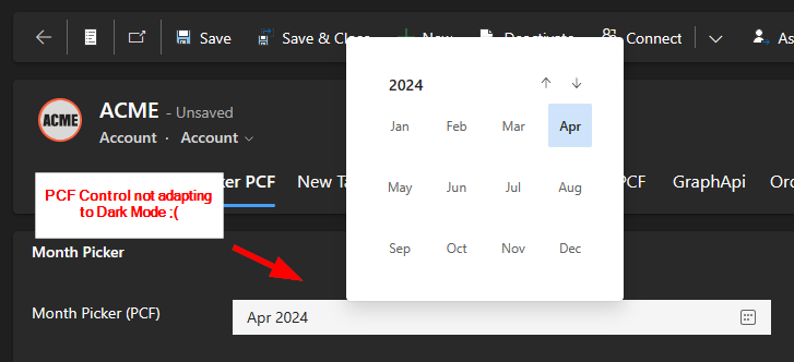
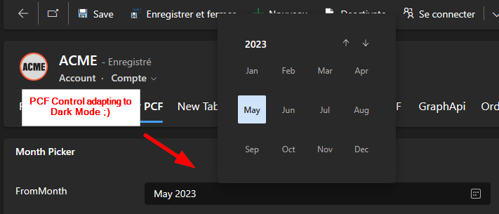
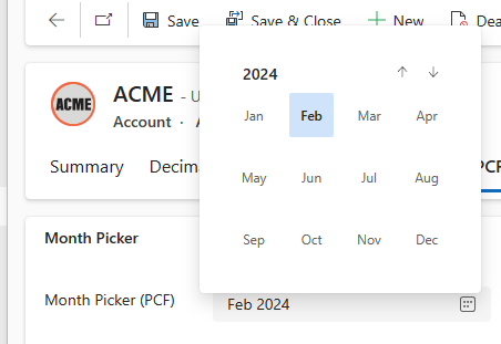
And as a matter of fact, that is exactly what happens with the Dark Mode switched on. You can see that the PCF controls are still rendering like they do in light mode … How would they know.
Here’s an example of my latest community PCF control, the FluentUI Month Picker
How to detect Dark mode at runtime ?
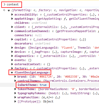
Fortunately, it is quite trivial to detect if a PCF control should render in Dark mode or not.
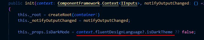
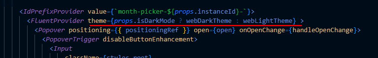
By inspecting the context object received by the PCF control at runtime, we can see that context.fluentDesignLanguage.isDarkTheme property will give us the answer.
After that its a matter of rendering the control with a Dark or Light theme depending on that value.
🎯Bonus point if you’ve already started to use FluentUI v9 to develop your controls. Since the theme is injected at the very root of the control in the FluentProvider, just provide webDarkTheme or webLightTheme accordingly and there is nothing else to do.
Note that these are the exact same themes used by the platform so your controls have a better chance to blend perfectly with the rest of the form.
More on theming :🔗 Concepts / Developer / Theming – Page ⋅ Storybook (fluentui.dev)
Now as expected, the control will render with the right theme depending on the users display preferences… it’s that easy.
Using this technique we can future-proof PCF controls and make them Dark Mode aware ahead of time. Hope this helps!
Links


Hi David,
Icons can be adapted for dark mode by adjusting the SVG. See https://pnp.github.io/blog/post/preparing-for-dark-mode-model-driven-app-icons/
Awesome, thanks for sharing 😉
[…] 💡 The Inspiration: A Push from David Rivard […]