
One of the most anticipated feature of the PowerApps Control Framework (PCF) last year was the Lookup datatype support. Hence the ability to bind a PCF control to a Lookup field in a Dataverse Model-Driven form to customize it’s behavior.
The feature was released last summer (see official post) and the first idea that came to my mind was to create a PCF control that renders a lookup field as a dropdown list instead of the of the out-of-the-box lookup selector.
I also wanted to add some cool features like :
- Display the record image 📷
- Customize the record display text
- Use the default view defined on the form to filter and order the dropdown values
The lookup datatype being a totally different beast than simple data types (like text or numbers), It proved to be trickier than I thought to develop a robust control and I got stuck for awhile. But, I took advantage of the holidays to put the finishing touches and I’m quite happy with the end result.
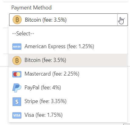
The control will turn the lookup selector…
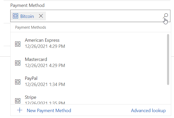
into a dropdown list…

I will show how to setup the control and hightlight some of my findings in this post but you can download it straight up from my GitHub repo or find it exposed in the PCF Gallery .
🚨 UPDATE 2022-01-20 : please use v1.0.0.2 or above of the control, a bug 🐛 was found in earlier versions
Also, If you want to dig deeper on the Lookup field functionality for the PCF Framework, I highly recommend the blog posts and videos from Diana Birkelbach and Andrew Butenko.
- A first look to the Lookup PCF – Dianamics PCF Lady (wordpress.com)
- Lookup PCF – let’s dive deeper – Dianamics PCF Lady (wordpress.com)
- You asked, I built – Showing lookup field as an Optionset using PCF – YouTube
Use Case for a Lookup Dropdown
Whenever you want to display a list of values to users, the recommended and easiest way is definitely to create a Choice column (optionset) in your table, define the values and expose them on the form. But, for many reasons, the use of an optionset is not always the best solution.
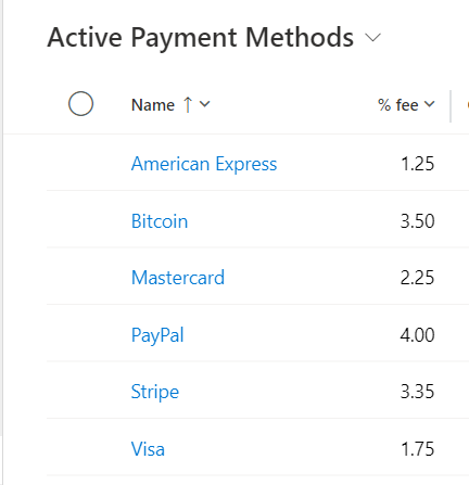
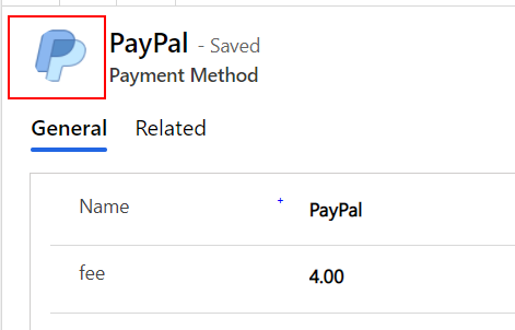
Sometimes, a selected value comes with additional data that shapes the underlying business logic. For example, each payment method in the example above could come with its own % fee and some calculation might depend on it. So by using a Payment Method table instead of a choice column, this is very easy to model and consume in your application logic.
Also, super-users of your application might want more control over the values of a selection displayed on a form (add, modify or delete) without having to ask the development team to push a new version of the app in production. Again, this is easily achievable using a table.
That being said, a lookup column displayed as a dropdown can provide a more intuitive and fluid UX than the lookup selector, especialy when there are few and consistent choices in the list.
How to Set-up the control
After you install the LookupDropdown.PCF solution in your Dataverse environment, you will be able to bind the PCF control to any Lookup field exposed on a form.
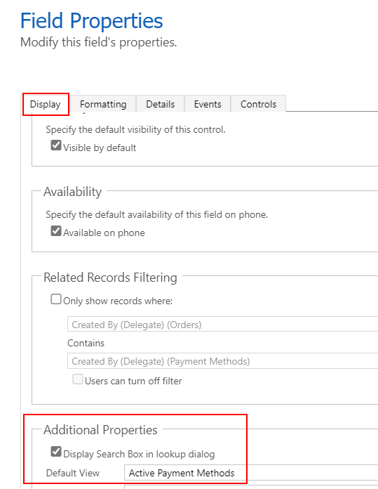
First, open your form in classic mode. Unfortunately (at the time of writing) PCF controls configuration are still not possible using the ‘modern’ form editor 🤷♂️.
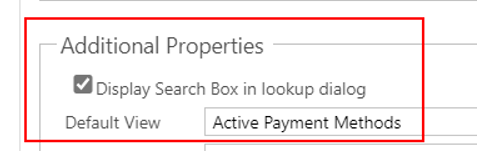
Now, when you configure a Lookup field, select the appropriate default view in the Display section. This view will be used by the PCF control to filter and order the values shown in the dropdown list.
Then, head to the Controls section and select the LookupDropdown control
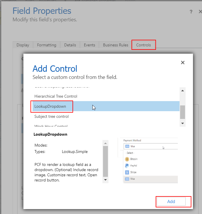
And add the desired configurations
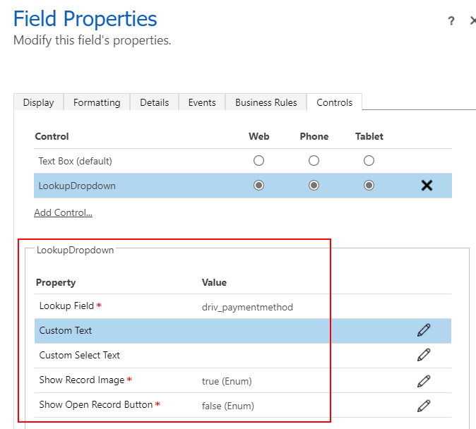
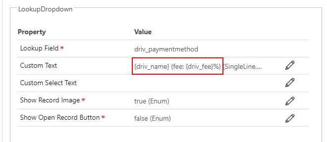
- Lookup Field : name of the bound lookup field (will be populated automatically)
- Custom Text : (optional) put column names between curly braces. leave blank to use the ‘Primary Name’ column. more on this later
- Custom Select Text : (optional) custom text for select text (empty), default = ‘Select’
- Show Record Image : select ‘true’ to show record images beside the display text
- Show Open Record Button : select ‘true’ to show a button that will open the selected record Edit form
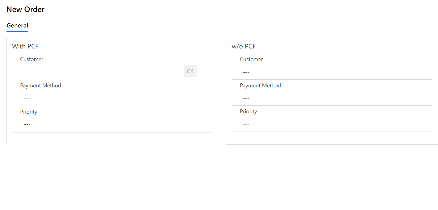
Thats all there is! You now have a way to render lookup fields as dropdown lists as seen in action below.
Now, let’s look more closely to some features of the control.
1️⃣ Show Record image 📷
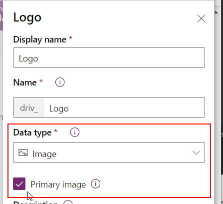
Without a doubt, my favorite feature ✨ is the ability to show the record image (Primary Image field) beside the record display text. I think that when used correctly, it adds meaning to the UI and provides a pleasant experience to end users. Here’s how to setup your tables to take advantage of it.
While some common tables like Account and Contact have a Primary Image column enabled by default, it’s quite easy to define on any table. Just create a column of type Image and check the Primary Image box.
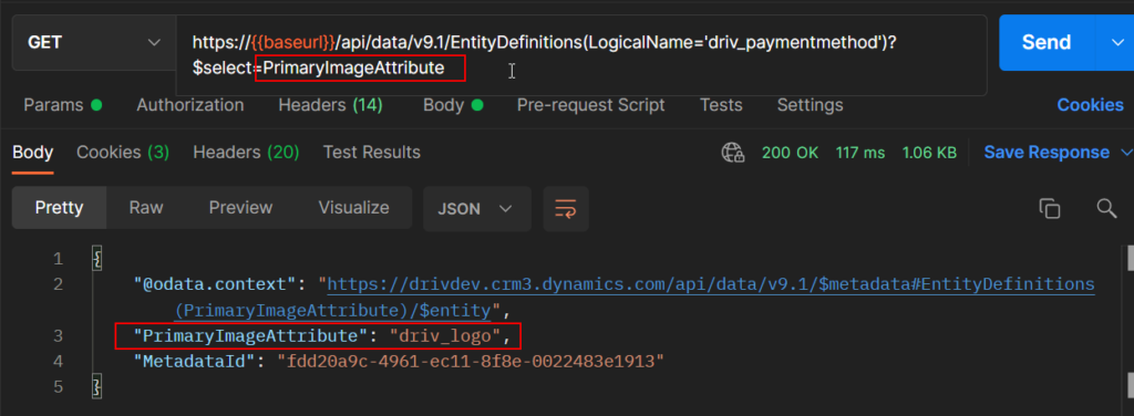
Once defined, the Primary Image attribute of a table is discoverable using a metadata query. This is used under the hood by the control to access image data.
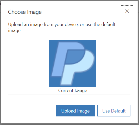
To set an image on a specific record, open it in edit mode and click on the upper left corner of the form. This will open a dialog where you can upload the record specific image.
Once saved, the image data (in base 64 format) can be retrieved from a web api call. This data will be used by the control when the ‘Show Image‘ property is set to true to display record images.
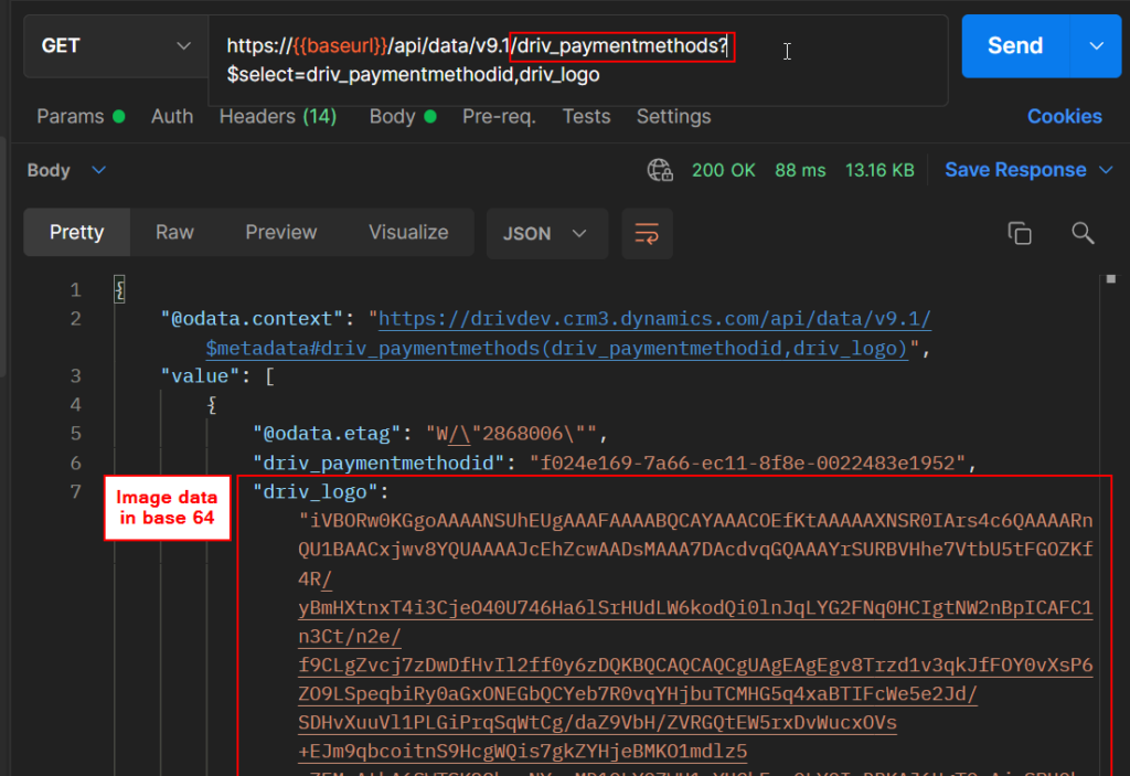
With the image data in base 64, you can create an adressable url that can be used within the PCF control code using this notation : url = ‘data:image/jpeg;base64,{base64image}‘. For example in a FluentUI ImageIcon. (see the code repo for the real implementation)
2️⃣ Customize display text
Another nice feature of the control is the ability to customize the display text of each record.
By default, the Primary Name column will be shown but this can be extended by suppling a value in the Custom Text property of the PCF control.
Provide the desired field(s) logical name(s) between curly braces {} and the record specific value will be replaced at run time. Any text that is not between culy braces will stand as a placeholder.
Piggy-backing on the previous example, setting a custom text like this :
{driv_name} (fee: {driv_fee}%)
Will render the dropdown with these custom text values.
This can prove quite useful, especialy when the Primary Name column is not what you want to show up to users.
3️⃣Fetch Default view records
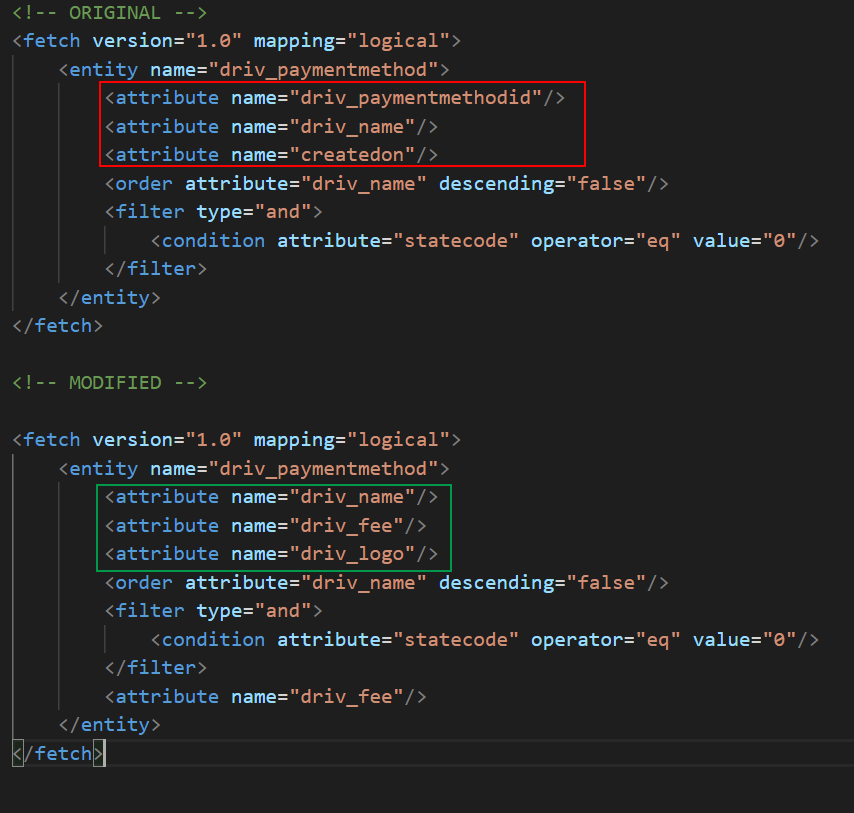
One of the major roadblock I encountered was to find a way to dynamically fetch the records using the default view that is configured natively on the Lookup field properties of the form where the PCF control is used.
This ensures that the values of the dropdown list are filtered and ordered as intended by the developer of the application.
After numerous design tentatives and headaches, I finally found a solution that fitted my need.
- Retrieve the fetchxml of the default view
There is a property of a lookup field parameter in the ComponentFramework.Context called getViewId, this will give the GUID of the default view
Using the viewid, its now easy to retrieve the view fetchxml using a retrieveRecord from the savedquery table. Note that I also convert the fetchxml string to a Xml Document object using a DOMParser for further usage.
Note. this code as been altered for simplicity, look at the code repo for the real implementation
- Manipulate the fetchxml
Now that we have the default view fetchxml, the goal is to modify the xml to include the fields (attributes) needed for the rendering of the dropdown list.
For example, we will want to add the Primary Image and other attributes required by the Custom Text property.
- Execute a WebApi request with the altered fetchxml
We now have everything in hand to make a RetrieveMultiple web api call on the main table using the modified fetchxml.
this.context.webAPI.retrieveMultipleRecords(this.lookupentityname, `?fetchXml=${fetchxmlstring}`)A getLookupRecords method could look something like this
Takeaway
The addition of the Lookup datatype support in the PCF framework brings up a lot of new possibilities and I really learned a lot while developing the Lookup Dropdown control.
I think that the control fills a gap and I will certainly use it in my current projects to enhance the user experience. I’m curious to see how it will be used by others and dont hesitate to drop me a line in the project discussion if you have any comments, issues or improvement ideas.
Links
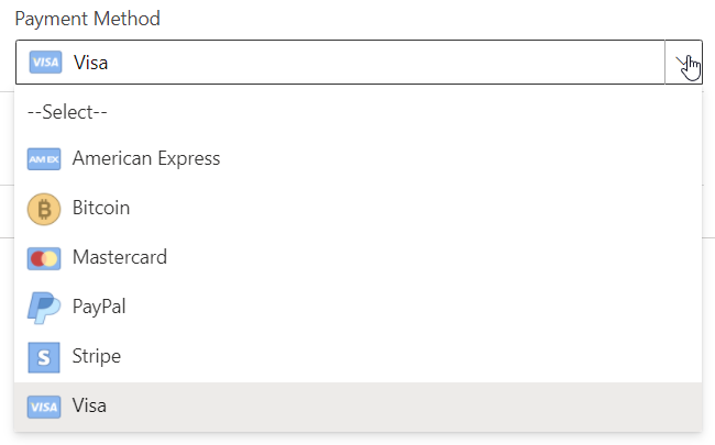


Photo by Daniel Kux from Pexels
This PCF control for Lookup fields is great but adding search or type ahead feature would be even better.
Hi Chad, Thanks for your interest in the control.
search and autocomplete was part of my initial design but unfortunately, I had to let it go for technical reasons.
Since I really wanted to include the record images, I opted for a FluentUI Dropdown control that does not include search capabilities.
I could render the same control using a FluentUI Combobox and have the search + autocomplete, but I would loose on the other end => no images.
Maybe I could implement a switch on the control ex. Enable autocomplete (true/false)
Feel free to drop comments/ ideas on the controls repository, it’s easier to track for me.
https://github.com/drivardxrm/LookupDropdown.PCF
It also ignores the ‘Related Records Filtering’ setting. We often use table lookup fields instead of Choice fields for the ability to do cascading lookups (ie. Country > State > City) where each table lookup gets filtered by the related lookup.
Stay tune, my next blog post is about that subject 😉
Hi David,
Thanks so much for this awesome PCF control. It works great in online, but I can’t get it to work in my offline app – it simply doesn’t display any records. Do you have any advice for getting this to work in offline?
Hi Patrick,
I’m really glad that you like the control. I don’t have a lot of experience with the offline mode, but I doubt that it could work. The way the control works, it needs to fetch some data from the tables at runtime. I will investigate to see what can be done.
Hi David,
Thanks for your response! Seriously you have created an amazing tool here!
I would agree that fetching the data at runtime seems to be the issue. When I am using the control offline, it displays, but no records show up in the control (i.e. just displays “–Select–“). I think all that would need to be done to make the control work offline would be:
1. Call Xrm.Utility.getGlobalContext().client.getClientState() to return whether the device is offline
2. I’m not sure how you are fetching the data at runtime (fetch query, odata, etc), but you could then pipe the fetch function through the Xrm.WebApi.offline if the client state was offline
The person using it would need to have all the records in the table in the offline profile, but this makes sense to me since we generally use this PCF for metadata records. In other works, there should only be a handful of such records in a given table, so downloading all of them wouldn’t be such a big deal.
Best,
Patrick
Hi Patrick,
I will definitely have a look at this.
I created an issue in the github repo of the control if you wish to track it.
https://github.com/drivardxrm/LookupDropdown.PCF/issues/14
Thank you for this control. It is exactly what I needed, and it was easy to setup and is working perfectly for me. I am using the “Dependent Lookup Field” option. I needed to use the Classic Form Editor as you mentioned. When I open the form in the modern designer it doesn’t show the label of the field for some reason though. I am concerned that other developers won’t know there is a lookup field there, as it just looks like a spacer control.
Hi Dave,
I have the same comment from a lot of people. I’m actively working on a workaround for this but I ran into some problems. I hope to resolve this shortly but my bandwidth is very tight these days. I’ll respond to this thread when I have a new version available. Thanks for your feedback.
the control does not show on power page portal… it gives an error “Lookup data type used by From (my_portaltation) is not supported for use with code components in portals.
Unfortunately I don’t have a portal to test