
In the frontend development world, Storybook as emerged as the industry standard to showcase and test UI components.
In this series of posts I will show how easy (and rewarding) it is to implement and publish a Storybook for a PowerApps Component Framework (PCF) project. That way users can have a direct and interactive access to the control without having to install anything on their side.
- Part 1, will focus on setting up Storybook and write the stories in the context of a PCF control project.
- Part 2, will demontrate how to publish the Storybook to Github Pages on every commit using GitHub Actions.
What is Storybook
In essence, Storybook is a framework that helps web developers express and test frontend workflows. It can be used for building, documenting, and testing UI components in isolation.
Stories are files that wraps up a specific component and supply a set of props and mock data. It provides a way to see different variations of a component and assess its rendering and behavior without the need to spinup the whole application.
When built, Storybook generate a beautiful static website out of the stories files that can be published and shared amongst team members (or publicly).
The ecosystem is highly extendable and the stories can also be reused with other popular tools like Jest and Playwright just to name a few.
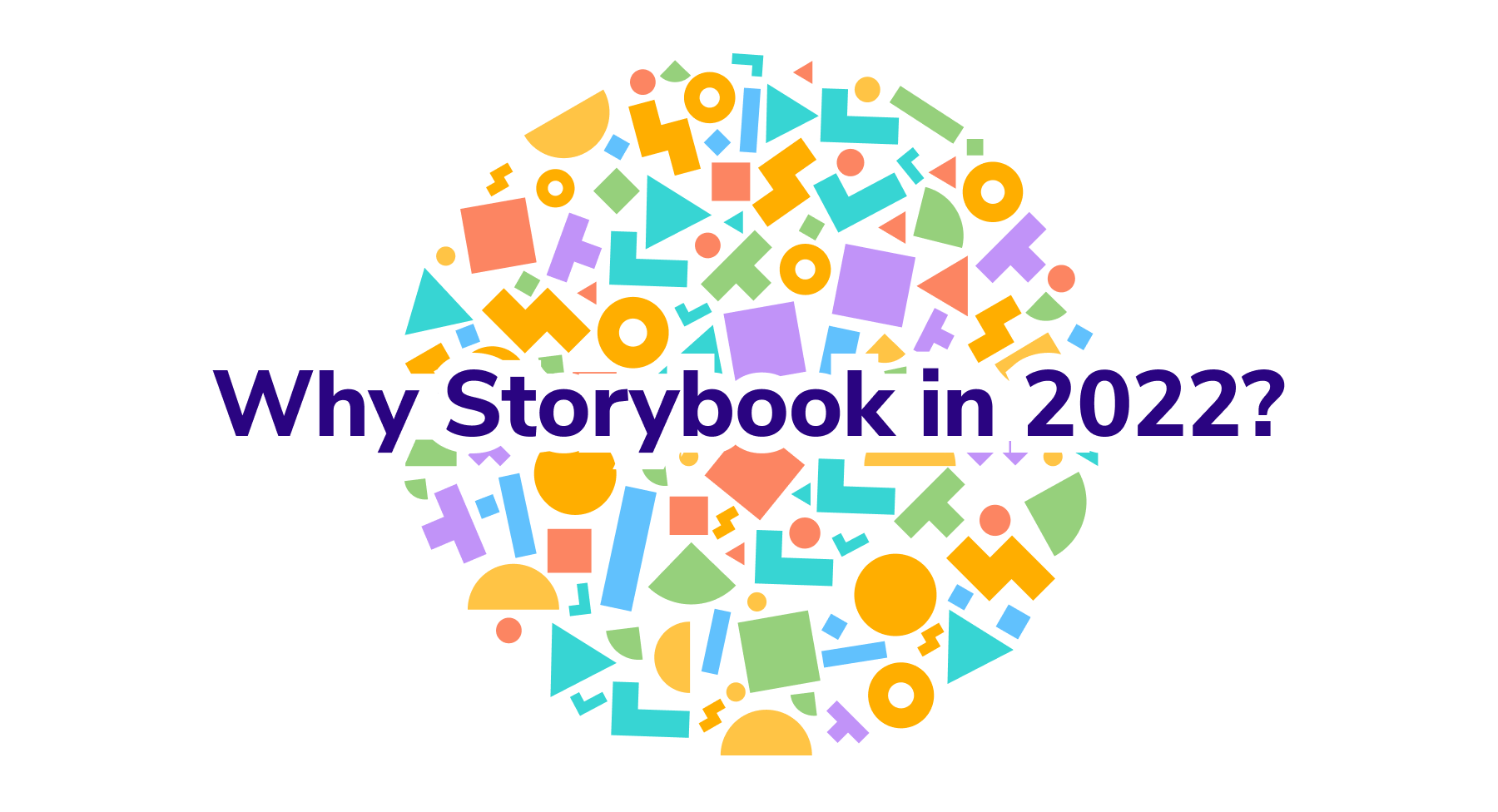
Here's a very good synthesis on the matter
👉Why Storybook in 2022?
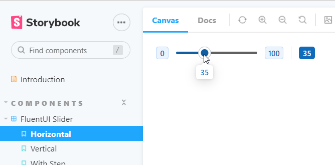
You can appreciate a Storybook generated site with the FluentUI React V9 official docs from Microsoft
👉https://react.fluentui.dev/
Is Storybook is a good fit for PCF controls ?
By design, PCF Controls are frontend components for Microsoft PowerPlatform that can be configured on a Dataverse Field or Dataset to change the platform out-of the box rendering.
By leveraging the PCF framework, developers can use modern frontend stack and libraries (React, Vue etc..) to build rich user experiences. The ultimate goal is to have controls that can be packaged, deployed in any Dataverse environment and used without any coding skills by the form configurators (Makers).
With this in mind, especially if you develop community PCF controls, a Storybook is a great way to provide a sneak peek of your controls to end users that might not be pro coders. Potential users can then have a good idea of the look and feel a PCF control before installing it on their environments.
I have already published a couple Storybook for some of my community controls, have a look here:
LIMITATIONS
Depending on how you designed your PCF Control, It might prove a bit difficult to implement your stories.
If the component you want to test has dependencies on the Datavese WebAPI or the ComponentFramework.Context objects, you will have to mock these objects in your stories because Storybook knows nothing about Dataverse and is not connected to a particular environment.
For those reasons, I recommend to remove any dependencies (if possible) on the PCF framework objects and use a flat interface for the component properties as we will see in the next section.
Use Case : Country Picker PCF
To better illustrate the setup process of a Storybook for a PCF control project, I will take one of my community project, the CountryPicker PCF, and guide you through the Storybook creation and publishing steps.
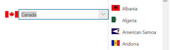
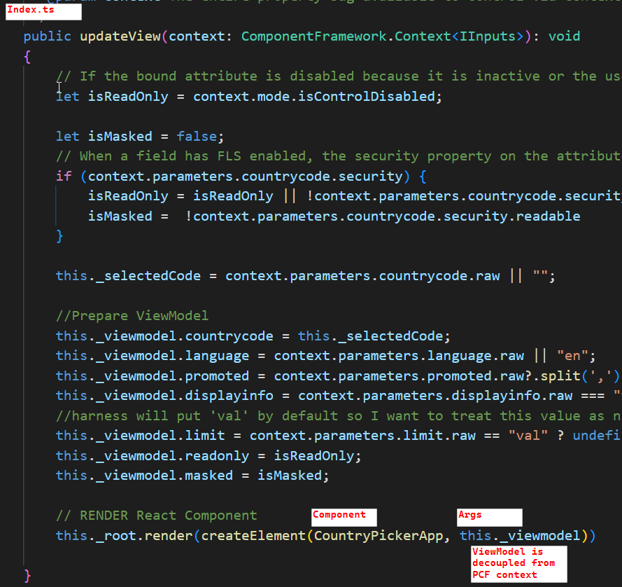
The main component of the PCF project is a React Component called CountryPickerApp and this will be the component being rendered by our Storybook..
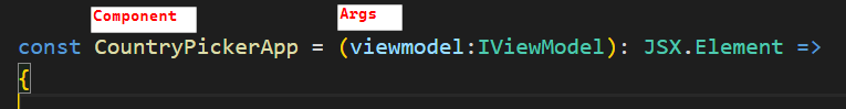
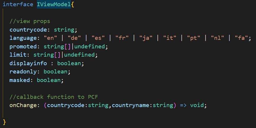
It accepts the following IViewModel interface as props. The interface is quite flat and the properties are derived from the ComponentFramework.Context parameters defined in the ControlManifest. There is also a callback function that notifies back to the form when a user selects a new country from the dropdown.
As seen in the index.ts screenshot, the viewmodel is completely decoupled from any PCF framework dependencies and the CountryPickerApp component will be easilly portable to Storybook.
Setup Storybook for a PCF project
In doubt or in case of roadblock, follow the official documentation, its quite straightforward.
Install Storybook
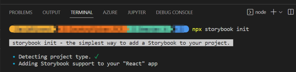
As a first step, install Storybook to your project. Assuming that you are using Visual Studio Code, open a terminal and run the following command at the at the root of the project
# Add Storybook:
npx storybook init
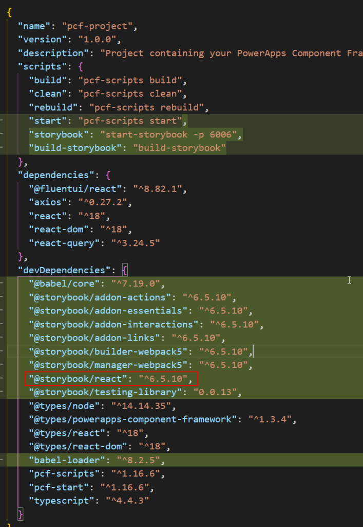
A lot of things will happen here, new dependencies and scripts (in greenbelow) are added to the package.json file. Most important, the installer detected that my PCF control is a React project and added the right extension package (@storybook/react)
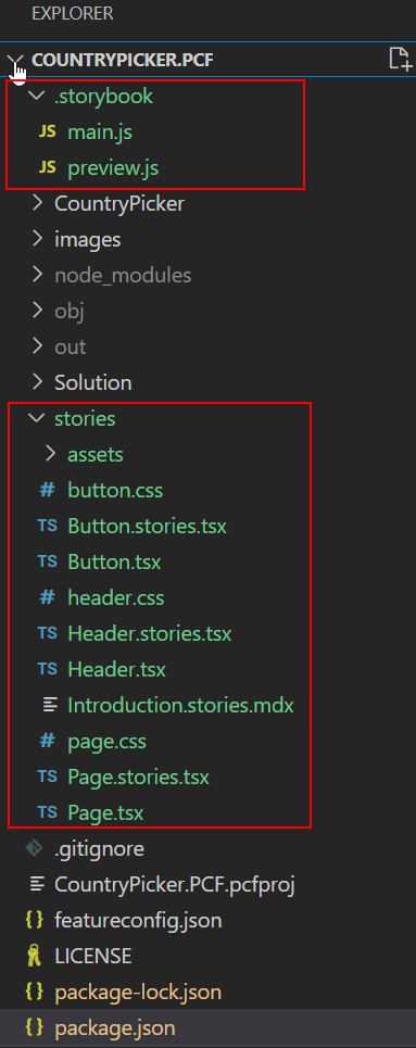
Notice also new folders that contains Storybook configuration files and boilerplate stories to get you up and running.
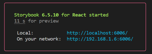
Before going any further, we can check that the Storybook can be built by running this command
npm run storybook
Alternatively, you can also run the start-storybook command from the NPM Scripts section in VS Code.
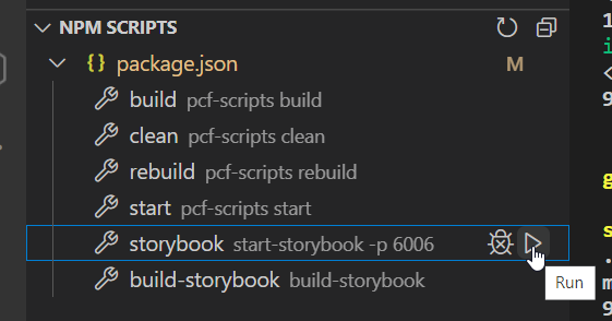
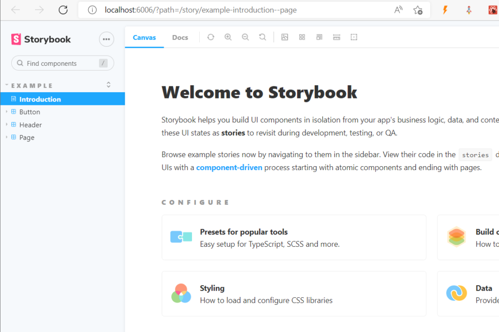
This will build a static website out of the content of the stories directory and serve the pages locally, it gives a good idea of what can be achieved.
Storytelling
Now here’s the real deal, it’s time to author our own Storybook content and tell the story of the PCF control project.
A good pattern is to have an Introduction page that summarize what the PCF control does and several stories (chapters) that represent specific use cases of the control. Of course you are not limited to that and you can build pretty much what you want here, be creative.
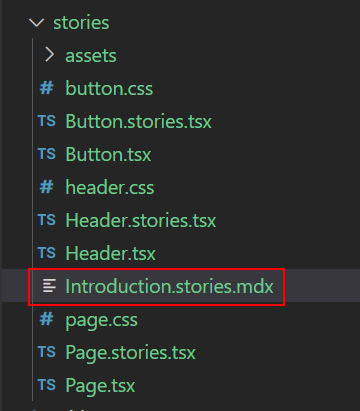
I’ll start by setting up the Intro page by opening the Introduction.stories.mdx file in the stories folder (added as a boilerplate during initial install).
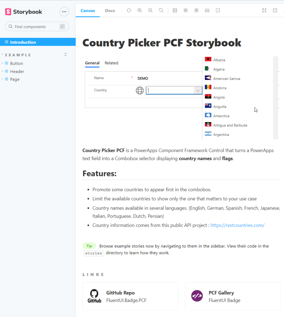
By tweaking the existing template and editing the files markdown and html, I’ll add some info on the control features and provide links to the Github Repo and the PCF Gallery link, here’s what it looks like. (see code in the repo for reference)
Now its time to add the actual stories. The subject is very vast so I strongly recommend that you read to the official documentation to learn the best practices and to get a grasp of all the possibilities of the Storybook framework.
👉 How to write stories (storybook.js.org)
Storybook stories are defined using the Component Story Format (CSF) which is an open standard not limited to Storybook.

Stories can be edited in different formats (js | ts | jsx | tsx | mdx) but for simplicity I will use tsx for this blog post.
The main part of a story file is called the default export, it describes the metadata about the component being storied. This is complemented by one or several named exports that represents the different flavors of the component being rendered (ex. different set of props)
As seen in the code below, the stories being defined by the default export will do the following.
- 1️⃣Render instances of CountryPickerApp (the main entry point of the PCF control).
- 2️⃣Decorate each stories with additional html for styling.
- 3️⃣Set some default arguments (props) for the control.
// CountryPicker.Demo.stories.tsx
// .. imports removed for clarity
export default {
title: 'Country Picker/Demo',
component: CountryPickerApp,
decorators: [
(Story) => (
<div style={{ margin: '3em' , maxWidth:'350px'}}>
{Story()}
</div>
)
],
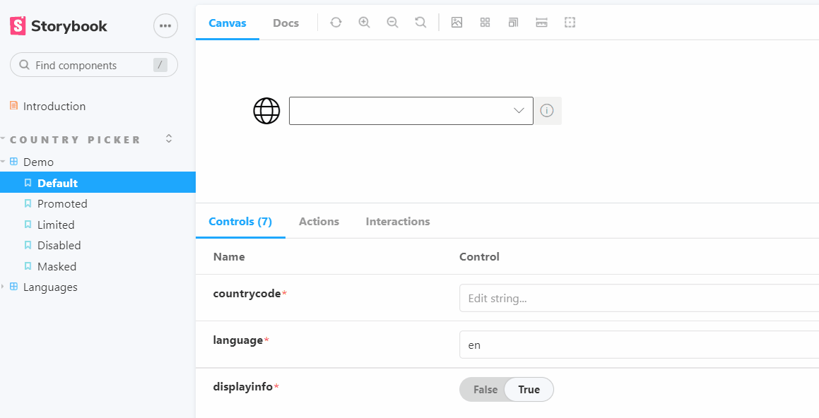
args:{
countrycode: '',
language : 'en',
displayinfo: true
}
} as ComponentMeta<typeof CountryPickerApp>;
In my story file, I want to display several flavors of the same components representing different uses cases. In order to have clean code, I will define a template that can be reused by all the stories.
Also, to help us down the road, I will add another package to the project. @storybook/client-api
npm install --save-dev @storybook/client-api
This package exposes a React hook called useArgs that i’m using to dynamically update the story args at runtime when a user selects a country from the dropdown. You can get more context from this blog post :
The template looks something like this :
const Template: ComponentStory<typeof CountryPickerApp> = (args) => {

  const [, updateArgs] = useArgs();

  args.onChange = (countrycode:string, countryname:string) => {
    console.log(`PCF NotifyOutputChanged  => ${countrycode}:${countryname}`)
    updateArgs({countrycode: countrycode})
  }
  return <CountryPickerApp {...args} />;
}
With a template in place, its now super easy to define the named exports that represents different stories (use cases) of the component. By binding the named export to the template, and supplying to each story a different variation of the arguments. (the final file can be found here)
export const Default = Template.bind({});

export const Promoted = Template.bind({});
Promoted.args = {
  promoted : ['CAN','USA','MEX']
}

export const Limited = Template.bind({});
Limited.args = {
  limit : ['CAN','USA','MEX']
}

export const Disabled = Template.bind({});
Disabled.args = {
  countrycode : "CAN",
  readonly : true
}

export const Masked = Template.bind({});
Masked.args = {
  countrycode : "CAN",
  masked : true
}
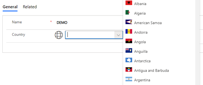
When the Storyboook is running, you can see that the countrycode argument is being updated dynamically when the user is changing the selected country.
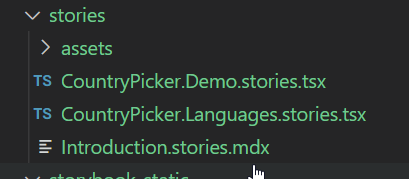
At the end, my stories folder contains only 3 files. I’m defining another story to display the different languages but the concept is the same (see the code in the repo for reference).
When built, these 3 files will generate a full-fledge, visually attractive and interactive website.
- All the different stories are hierarchically displayed on the left side.
- Each story renders its own instance of the CountryPicker component with different permutations.
- Most important, the user can test the components and change the input parameters as he wish.
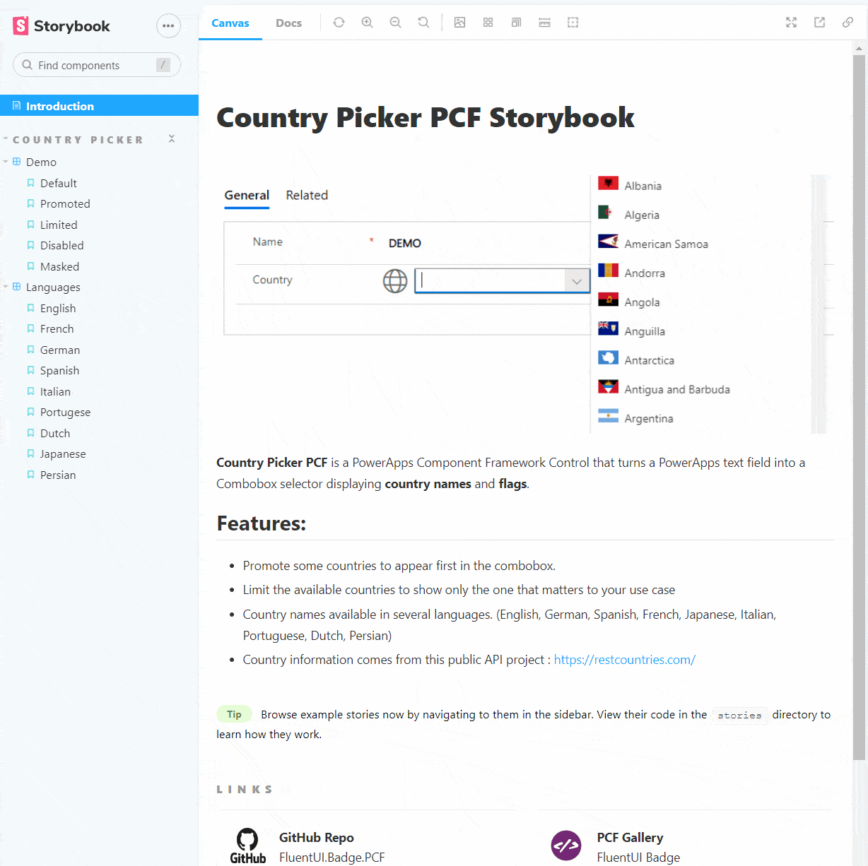
In my opinion, this is pure gold and adds a lot of value for the end users as well as for developers.
You can browse the CountryPicker PCF Storybook here https://drivardxrm.github.io/CountryPicker.PCF
We’ll take a break for now and in the next post, I will show how to publish and host the Storybook to GitHub pages for everyone to enjoy.
Stay tuned!
Links

Be First to Comment